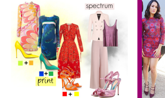
 Brie's got me back on my color kick again! :) Black, schmack, tan schman. Let's ditch the neutrals have FUN! :). Prints have been dominating fashion for the past few seasons in all kinds of iterations. While there are plenty of amazing prints with one or two colors, Brie's dress showcases a complex one, with a myriad of different hues worked in. The cataclysm of color creates a fabulous opportunity to play with the shading in a super sophisticated way: mixing, without matching. The classic way to work with print is to pull out a shade that's already in the print and highlight it via your accessories. But, if there are enough colors, you can also work in a shade that isn't, but looks like it is, in a kind of color trompe l'oeil ( "trahmp lay", French for "trick the eye"). The easiest way to visualize this idea is by using a color wheel, a painter's aid for understanding color. Refresher course: red, blue and yellow are primary colors, meaning they are original hues and not derived from combinations (unless those combo's already included them to begin with). Secondary colors are created from two primary colors (e.g., red and blue make purple). Tertiary hues are the ones between primary and secondary shades on the wheel. They're the ones of central importance here. By looking for a combo of one primary and one secondary color in your print, you can use the color between them on the wheel as your accent shade. For example, Brie has bright blue and pinky-purple violet in her print. Her shoes are a deep grape, which falls into the blue-violet category. Similarly, when your print contains lime (yellow-green) and mango (yellow-orange), you can use yellow shoes. When the print incorporates cobalt with emerald, you can use aqua. It's such a funky, chic way to play with colors! But, if all that seems like a llllllot of drama to you (and I ttly hear you because it's very bold look!), the mixy-not-matchy thing can be done with a single-color look as well. Say what? Oh yes. Again, the trick is combining a variety (at least three) different colors in the same family. Again, the color wheel can help with visualizing it. Start with your chosen color and then look at the wheel to find analogous shades (those on either side of it). The plum/violet cami is the anchor of the spectrum look above. The lilac pants and shoes go a tiny bit more blue-ish (and paler! Changing intensity is completely allowed :)), while the ice pink jacket is a touch redder (pink is red-violet mixed with white and sits on violet's right side on the wheel). Conversely, blue violet equates with lilac and sits on violet's left side. Staying within the family of analogous hues gives the look variation, but also harmony. I hope this inspires you to try some wild and crazy things with color sometime soon, loves! Happy styling :)
0 Comments
Leave a Reply. |
Welcome to the place where wrestling & fashion join hands. Inspiration. Reviews. Musings. Retros. FASHION. Covering and craving gear to gowns since 2011. May the Fierce be with you! ;) Peace & Glitter!
AuthorBrie: shoe-lover :) fashion-lover and generally glamorous semi-dork Archives
July 2019
Categories
All
Photos used for criticism and comment under US Copyright Act Section 107.
|
 RSS Feed